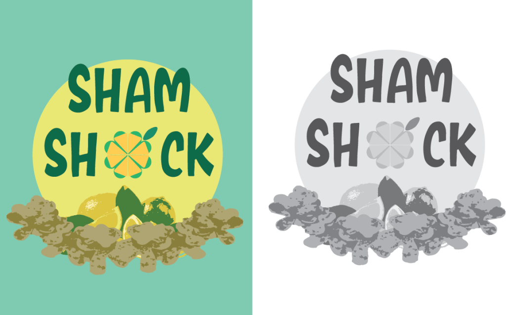
This beautiful logo is a design for a hypothetical company that sells four leaf clover shaped chips. The logo shows all the values of the company in a simple way, the main icon in the middle is recognizable and depicts a four leaf clover to represent the chip with a lemon on top to represent the sour taste. The icons at the bottom show the main ingredients and the color represents nature, health, and happiness. This product is for all ages so the bright colors may set itself apart when on a shelf next to competitors. I am personally proud of the icon and the color choice but I could have created a more creative name and cleaned the middle icon up.
